A PSA WEBSITE FOR BOOK BANNING
The act of banning books is not a new one. Censorship like this has existed since the 1600s and likely before. Many advocates of book banning argue that it is done in protection of the minds of children. But the types of books that are being banned are not always in line with that thinking. Books that help children figure out and accept their identity are usually targeted.
The moodboard created for this project.
THE VISION
The goal for this project was to educate teens on the practice of book banning, hoping to inform them of its dangers and inspire them to take their learning into their own hands. To do so, I would create a website that would be bright and use many geometrically graphic elements.
The chosen colors for this project.
PROCEED WITH CAUTION
These colors were chosen because of their high contrast and brightness. Yellow is an eye-catching color and usually denotes the idea of "caution," especially on road signs. Choosing these colors would attract a lot of attention.
SOFT, YET STERN
Filson Soft as chosen for its rounded corners. Though I want to draw attention to this topic and how harmful it can be. I also wanted visitors to not feel like it something to be scared of, more someting to be aware of.
The progression of wireframes and design throughout the process.
KEEP IT COMING
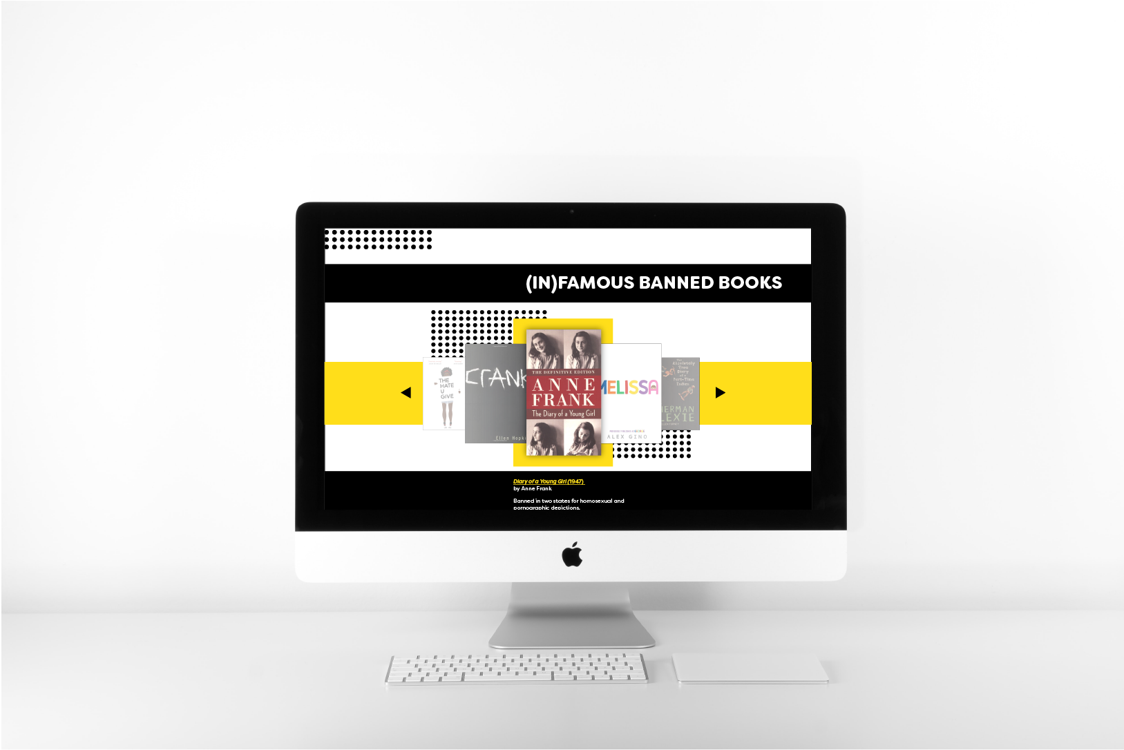
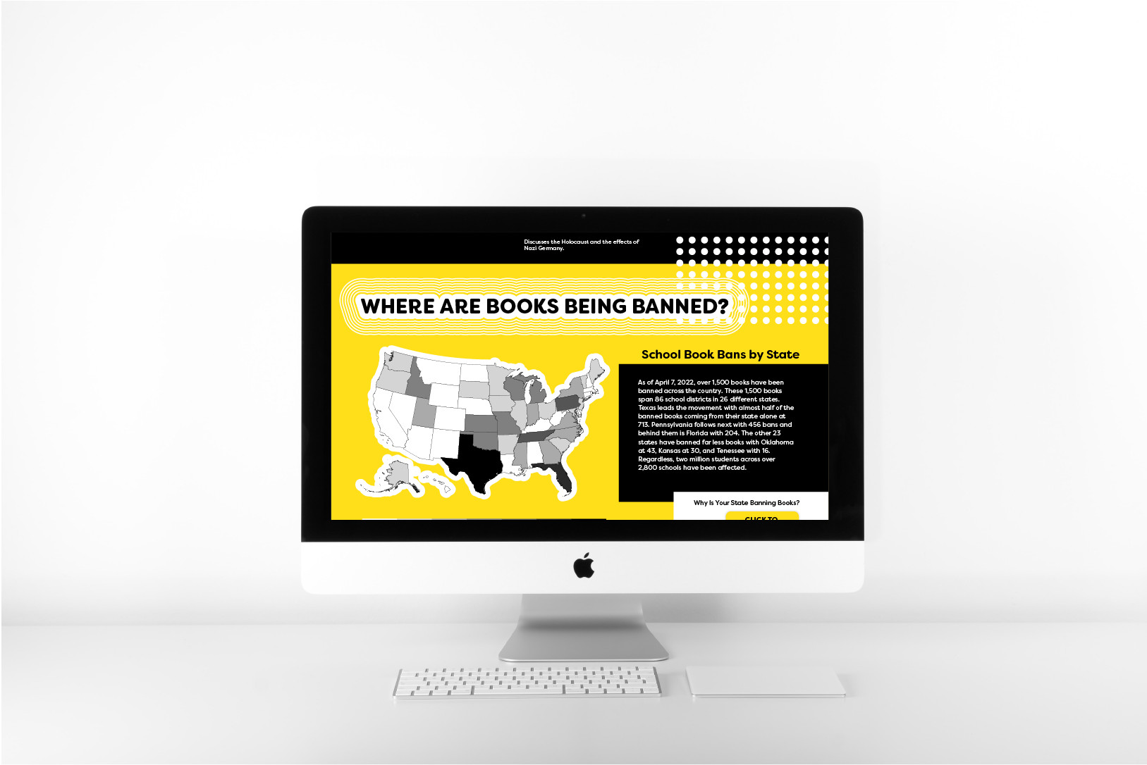
The design for the website was one long screen divided into multiple sections consisting of context, infamous banned books, a national infographic on book bans, and other resources that can expand one's knowledge.
I decided to demarcate these sections using color blocking, but to make sure that people kept scrolling, I placed graphical patterns across these sections so that something was always leading the viewer down the page.


Above are mockups of the site as they would be seen on the computer.
Social media promotion posts with elements from the website condensed for appropriate platform consumption.
SOCIAL GOOD ON SOCIAL MEDIA
The two posts created for social media help apply the design in more than just a website format. The hope is that this draws the viewer in and brings them to explore more about the topic.
For this, information was paired down and infographics were reformatted to fit the square screen size.